अगर आप चाहते हैं कि आपकी website या blog को mobile पर पढ़ने के लिए लोगों को बहुत ज्यादा scroll और zoom न करना पड़े… और आपकी website mobile, tablet, computer इत्यादि सभी प्रकार की screen पर पढ़ने के लिए आसान हो… तो आप ‘Responsive Web Design’ को ही खोज रहे हैं…
आज 2026 में जब India में 80% से ज्यादा internet users mobile phone से browsing करते हैं… तो Responsive Design होना किसी भी website के लिए must है… Google भी Mobile-First Indexing use करता है… मतलब अगर आपकी site mobile-friendly नहीं है तो Google ranking में भी problem होगी…
Responsive Web Design क्या है?
‘Responsive Web Design’ वह तरीका है जिससे आपकी website का layout user के browser screen size के अनुरूप बदल जाता है… आपकी website के menu, लेख, sidebar इत्यादि का स्थान और प्रदर्शन दोनों आप user के browser के हिसाब से नियंत्रित कर सकते हैं…
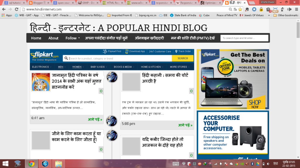
उदाहरण के लिए ‘HindiInternet.com’ को यदि computer में खोलें तो ऊपर जैसी दिखेगी… लेकिन यदि इसी address को अपने mobile phone में खोलें तो ये इस प्रकार नजर आएगा:

ये screen के size के हिसाब से website का अपने आप layout बदल लेना ‘Responsive Web Design’ कहलाता है…
2026 में Responsive Design क्यों जरूरी है?
| Reason | Detail |
|---|---|
| Mobile Users 80%+ | India में ज्यादातर लोग mobile से internet चलाते हैं — अगर site mobile-friendly नहीं तो visitors bounce कर जाएंगे |
| Google Mobile-First Indexing | Google पहले mobile version देखता है ranking के लिए — non-responsive site की ranking गिर जाएगी |
| Better User Experience | Responsive site पर user ज्यादा time spend करता है — bounce rate कम होता है |
| Single URL Management | अलग mobile site (m.example.com) बनाने की जरूरत नहीं — एक ही URL से सब handle होता है |
| Higher Conversion Rate | E-commerce sites पर responsive design से sales 20-30% बढ़ सकती है |
| Social Media Sharing | Shared links सभी devices पर अच्छे दिखते हैं — better engagement |
| Future-Proof | नए devices (foldable phones, smart watches) पर भी site automatically adjust होगी |
Responsive Web Design कैसे काम करता है?
Responsive design 3 main technologies पर based है:
1. Flexible Grid Layout
Fixed pixel sizes की जगह percentage-based widths use होती हैं… जैसे एक column 50% width का है तो वो किसी भी screen size पर आधी screen लेगा…
2. CSS Media Queries
ये CSS का वो feature है जो screen size detect करके different styles apply करता है… जैसे mobile पर sidebar hide कर दें और desktop पर दिखाएं…
3. Flexible Images
Images को max-width: 100% set करके responsive बनाया जाता है… ताकि image अपने container से बाहर न जाए…
Responsive Website कैसे बनाएं? — Step-by-Step Guide
| Method | Difficulty | Best For | Cost |
|---|---|---|---|
| WordPress + Responsive Theme | Easy | Bloggers, Small Business | Free – ₹5000/year |
| Website Builders (Wix, Squarespace) | Very Easy | Non-technical users | ₹200-1000/month |
| Bootstrap Framework | Medium | Developers, Custom sites | Free (open source) |
| Tailwind CSS | Medium-Hard | Modern web developers | Free (open source) |
| Custom CSS (from scratch) | Hard | Expert developers | Free |
WordPress Users के लिए (Easiest Method)
अगर आप WordPress use कर रहे हैं तो बस एक responsive theme install करें… Astra, GeneratePress, Flavor जैसे themes automatically responsive होते हैं… Theme install करते ही आपकी site mobile-friendly बन जाएगी…
Blogger Users के लिए
यदि आप ‘Blogger.com’ जैसे blogging website का प्रयोग कर रहे हैं तो Google में ‘Free Responsive Blogger Template’ खोज कर उन्हें अपने blog के लिए प्रयोग कर सकते हैं… इससे आपका blog responsive बन जाएगा…
HTML/CSS सीखकर बनाएं
अगर आप coding सीखना चाहते हैं तो W3Schools और freeCodeCamp से responsive web design free में सीख सकते हैं… ये long-term skill है जो career में बहुत काम आएगी…
अपनी Website Responsive है या नहीं — कैसे Check करें?
| Tool | How to Use | Link |
|---|---|---|
| Google Mobile-Friendly Test | URL डालें और check करें | search.google.com/test/mobile-friendly |
| Chrome DevTools | F12 दबाएं → Toggle Device Toolbar | Browser में built-in |
| Responsinator | URL डालें — different devices पर preview देखें | responsinator.com |
| BrowserStack | Real devices पर test करें | browserstack.com |
Responsive Design सीखने के लिए Best Resources 2026
| Resource | Language | Cost | Best For |
|---|---|---|---|
| W3Schools | English | Free | Beginners |
| freeCodeCamp | English | Free | Complete web development |
| YouTube Tutorials (Hindi) | Hindi | Free | Visual learners |
| Udemy Courses | English/Hindi | ₹399-999 | Structured learning |
| MDN Web Docs (Mozilla) | English | Free | Reference documentation |
👉 Web Design Books Hindi — Amazon | Web Development Books
Common Mistakes — Responsive Design में ये गलतियाँ न करें
| Mistake | Solution |
|---|---|
| Fixed width (px) use करना | Percentage (%) या rem/em units use करें |
| Images को responsive न बनाना | max-width: 100% और height: auto set करें |
| Touch targets बहुत छोटे | Buttons minimum 44×44 pixels रखें |
| Font size बहुत छोटा | Mobile पर minimum 16px font रखें |
| Viewport meta tag missing | <meta name=”viewport” content=”width=device-width, initial-scale=1″> जरूर add करें |
| Heavy images load करना | WebP format use करें और lazy loading enable करें |
FAQ — Responsive Web Design से जुड़े सवाल-जवाब
Q: Responsive design और mobile app में क्या difference है?
A: Responsive website browser में open होती है किसी भी device पर… Mobile app separately download करना पड़ता है… छोटे businesses के लिए responsive website ज्यादा practical और सस्ती है…
Q: क्या WordPress themes automatically responsive होते हैं?
A: 2026 में ज्यादातर modern WordPress themes responsive हैं… लेकिन पुराने themes check करें… Astra, GeneratePress, flavor जैसे popular themes fully responsive हैं…
Q: Responsive design से website slow होती है?
A: नहीं, अगर properly implement किया जाए तो responsive site fast होती है… Images optimize करें, lazy loading use करें, और good hosting लें…
Q: क्या responsive design SEO में help करता है?
A: बिल्कुल! Google Mobile-First Indexing use करता है… responsive site की ranking बेहतर होती है non-responsive site से…
Q: Responsive website बनवाने में कितना खर्चा आता है?
A: WordPress पर free responsive theme use करें तो बस hosting cost (₹2000-5000/year)… Custom design बनवाएं तो ₹5000-50,000 depending on complexity…